
.webp?width=832&height=592&name=customer-support%20(1).webp)


 Car Finance
 Cars & Gadgets
 Car Maintenance
 Tips & Advice
 News
News
 Road Trips
 Pop Culture
.webp?width=400&height=285&name=online-shoppers-with-dog%20(1).webp)


.jpg?width=500&height=356&name=Vintage%20car%20going%20to%20an%20old%20town-1%20(1).jpg)


Written by

Verified by


Hey guys! It's Amy from Carmoola here, sharing our latest behind the scenes look into all things Carmoola 👋 A quick intro, I look after Product, Marketing and Operations here at Carmoola, and my secret weapon that drives it all is my passion for Behavioural Economics. It helps us understand the biases that affect our everyday choices, and challenges the notion that we are all rational beings. Spoiler alert 🚨 Humans are not rational!
Today, I'm going to share a little about Behavioural Design, which uses insights from Behavioural Economics to help design solutions and products that change behaviour - for the better! That part is really important. We're not trying to manipulate people into doing something they shouldn't. The key principle of this approach is guiding customers towards making the right decisions, that are best for their health, wealth and well-being.
What is Behavioural Design? 🧐
Behavioural design is a scientific process we use to develop our product, and customer related processes. It involves 3 key steps:
1. Behavioural Diagnosis
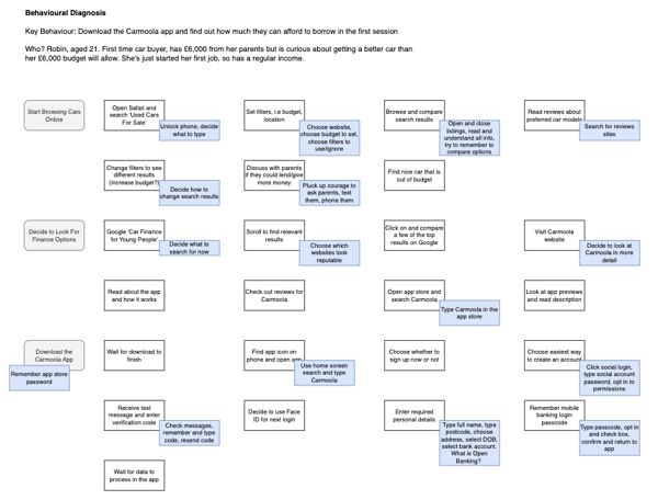
We first have to decide exactly what behaviour we're designing for. What exactly do we want our customers to do? It's important to be really specific here, so not just "Download the app" but perhaps something more like "Download the Carmoola app after visiting our website, and find out how much they can afford to borrow in the first session".
During the diagnosis, we need to break down every single step the customer has to take to get to this behaviour, and we build out a behaviour map of these steps.
Whilst at first glance, downloading an app might seem like just one or two steps, once you really start to think about it, there are tens, if not hundreds of small steps and decisions a customer has to make, and understanding them all is key.
Here's an example of a basic behavioural map for the behaviour we mentioned 👇
2. Identify Psychologies
The next step is to start thinking about which psychological biases or barriers might be affecting the customer's journey towards the desired behaviour. We use a framework of the 3B's: Behaviours, Barriers, Benefits.
- Identify the behaviour
- Reduce the barriers
- Amplify the benefits
For example, before a customer can start their application, we need them to sign up and create an account (behaviour). We know that signing up to yet another product can feel like quite a large cognitive load on the customer, and can be a big barrier.
In this flow, we make sure that inputs are pre-populated or auto-focussed, other actions can be completed in one tap, and we use as few screens as possible (reduce barriers). We then layer on positive reinforcement (amplify benefits) which motivates the customer to complete their account.
We utilise other cognitive biases and principles to our advantage, such as progressive disclosure of questions (doing the easy stuff first like asking their name, and leaving the harder stuff until later like asking their email marketing preferences) and the goal gradient effect (showing customers their progress to increase motivation as they near the end). You'll spot these examples, plus some others in the screen recording below 👇
3. Experimentation
Now that we understand more, we put together hypotheses of the behaviours we expect to change, and then we start to think about exactly how we can test each hypothesis.
In the example above, our hypothesis could be: If we pre-populate and or auto-focus every field in the signup flow, then more people who start the signup flow, will complete it.
To run this experiment, we can add the changes in the latest version of the app, and compare the number of account signups on the new version, versus the previous version. We always keep one eye on the statistical significance of our findings, and run the test until we can be sure the newer version is more effective.
Some of my favourite moments in the product 🥰
The Checklist
Who doesn't love a to-do list, am I right?! I know some of you even add one or two items at the top of your list that you've already done, just so that you can tick them off immediately! Yes, I'm looking at you 👀
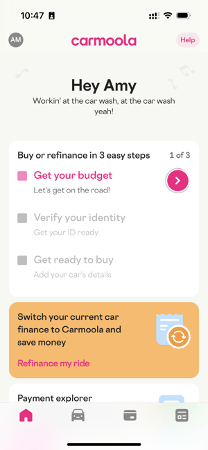
This checklist approach works for a few reasons. Firstly, the Zeigarnik Effect. People tend to remember incomplete tasks better than completed ones, and those incomplete tasks weigh heavy on their minds! It's a bit like someone only telling you the opening of a great story, but never telling you what happens in the end! Secondly, there is also a Feedforward Effect happening, where users know what to expect before taking any action. This helps to alleviate any worries about the unknown (or barriers) that the user might be feeling when starting to interact with a new product. Thirdly, we are utilising the Spark Effect, where users are more likely to take action when the perceived effort is small. Breaking the application journey into 3 parts feels manageable, and easy.
Celebrity Birthday
Car finance is boring. Yep, I said it! So why not bring some FUN into the application journey 😁 In all seriousness, we're here to help customers skip to the good stuff, and keep boring to a minimum, so whilst we do need to get some info in order to complete the application, it makes sense to make people smile whilst we do it!
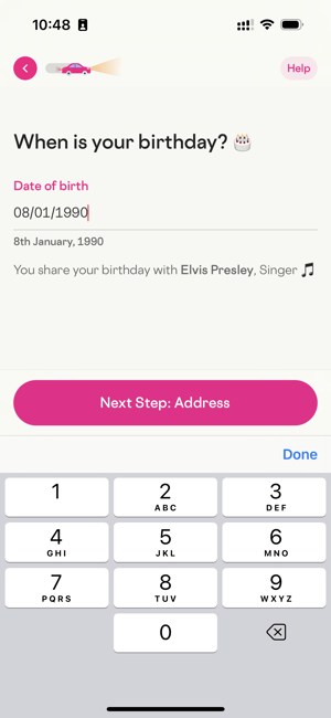
In this screen, (2nd screen in the application journey) we're utilising the Halo Effect. Making people smile so early on in their journey sets them on a good path towards enjoying the rest of their Carmoola experience. People tend to judge things based on their feelings towards one particular trait, so we create this fun moment that they can remember, and hopefully it helps to shape their positive feelings towards Carmoola as a whole 😊
Loading Your Budget
Carmoola is on a mission to deliver easier, faster and cheaper car finance, and whilst that's great, sometimes faster is not always better. Let me give you an example. Let's say you go to a fancy restaurant and order a nice bottle of wine... but the waiter rushes out with it and just slops it in your glass like they would tap water 😱 They've totally ruined the experience, and devalued the wine you were looking forward to. Another great example of this is going to a spa. Do they have to speak more softly and slowly? Ask you to fill in a questionnaire about what you're hoping to get out of your visit to the spa today? Bring you a nice drink and encourage you to for a while after your massage before leaving the spa? Nope! But it sure makes it feel more luxurious 🛁.
For some moments, added friction and slowing things down helps to build suspense, and demonstrate the value of the hard work that's going on to create this special moment.

In this scene, you can see how we try to build suspense up to a moment of delight, when the customer finally sees their budget for the first time 🎉
Classic Behavioural Economics books you'll love 📚
If you're still reading - firstly, well done! And secondly, maybe Behavioural Economics and Behavioural Design are something you'd be interested to read more about. Here are some absolute bangers that you should put on your reading list 💥
- Predictably Irrational, Dan Ariely
- Thinking, Fast and Slow, Daniel Kahneman
- Nudge,Richard H. Thaler; Cass R. Sunstein
Thanks so much for reading, and I look forward to seeing you next week for another behind the scenes exclusive!

What does the total amount payable mean in car finance?
Total amount payable is the full amount you’ll pay for a car finance deal, including the amount you borrow, interest, and any...

Can you get car finance without a driving licence?
Yes, lenders like Carmoola offer car finance without a driving licence. Carmoola accepts applications from customers with a UK...

Getting car finance with a CCJ: what you need to know
You might still be able to get car finance with a CCJ (County Court Judgment), but you’re likely to face stricter checks and...